About this site
RSS feed
What happened to Bald Condensed? Nothing, it just appears less frequently, that's all. New editions of Bald Condensed will be announced in the news feed from now on.
The place is a building site right now, and archives of news, Bald Condensed and other articles will be back online shortly.
Al content on this site is Copyright ©1999-2008 David John Earls and Yves Peters, with all rights reserved.
Constantia, Corbel, Calibri, Cambria, Candara and Consolas, the new system fonts for Vista that are optimised for sub-pixel antialiasing, have shown up on the Microsoft site as downloadable samples. They're available in XPS format, which means that hardly anyone will be able to view them. Clever!
I asked if anyone knew of alternatives for the majority who can't read XPS, and Tim Brown emailed in to the rescue - he's put up PDF and TIFF versions. Bless him... If you're a Mac user on a LCD screen, open the PDF in Preview and view it at Actual Size - the sub-pixel antialiasing should work, bar for any minor differences between Mac and Windows gamma.
Interestingly, this is the first time I've ever seen sub-pixel antialiasing that didn't give me colour flashes around the type when reading it (then again, no-one I have spoken to about this phenomenon sees it), a problem I first encountered all the way back in the days of Microsoft Reader on Windows CE. I am very impressed by the quality, especially if it translates that well into the real world (and my mac isn't magically altering it). The fonts themselves look superb on screen, which I would imagine is as much to do with being designed by such talents as Jeremy Tankard and Lucas de Groot as it is to do with the technology.
There is great controversy surrounding the collection, as I'm sure Yves will pick up if and when he peers over it for a future Bald Condensed column, but that aside, I have to say, well done Microsoft.
Typographer.org comes out of beta this coming weekend, and there is a fairly large surprise in store...
Well, I think the name says it all, even if you don't speak the lingo. Composed of 40% sales, 30% historical relevance and 30% aesthetic value, as voted on by a panel of superheros dressed in huge flowing capes emblazened with typographically-hip logos.
Creative Review here in the UK has launched a special edition edited by design agency Mother. The cover comes complete with a Peter Saville sticker that smells suspiciously like the very cheapest kind of irony. Fancy that! As Yves said, "So Peter Saville set crappy Arial. Big deal!"
Derbyshire, UK
Monotype is planning to float, and has filed an IPO proposal to the Securities and Exchange Commission in the US. We can look forward to a future of maximising stockholder value, I'm sure.
St Bride here in London will be hosting an exhibition preview and talk by Alan Kitching. Alan Kitching's work is inspirational, not just keeping alive the beauty of letterpress, but pushing it forward. The preview is from 5.30pm, followed by the talk from 7pm, on February 20, 2007. Entry is a fiver, or three quid "concessions". I can't not go to this one.
Tate Britain, Pimlico, London
Starting with the understatement of 2007, "Professional typedesign is complex enough as it is", the extremely clever guys at Letterror have released Superpolator 2, a true MacOS X app developed from their Python library. It's Multiple Masters on steroids! From the website, "FontLab's interpolation tools are based on Adobe's Multiple Master technology. A breakthrough in 1993, but restricting and limiting today. Superpolator remedies that by introducing a flexible way to build interpolation systems. The tool has to accomodate the typeface, not the other way round."
Yesterday, the Doomsday Clock was set forward 2 minutes to 11.55. Designed by Pentagram, and the product of a group of scientists from the Manhattan Project, it represents the potential closeness to the end of civilisation by... well, take your pick, huh? The hour hand reminds me of a decapitated head, and I'm not altogether sure that was an accident. Now, back to work designing those new campaigns for Landrover, Easyjet and Monsanto, kids...
Download a copy of Alessandro Segalini's biography of Giambattista Bodoni. It's jolly good.
With the rather open brief of "design projects where typography is used as the primary visual element", Communication Arts is soliciting submissions for their May/June edition. Apparently, there is no cost to you in helping their editorial staff produce a profit-making mag!
P22 has finished off converting across its entire collection to OpenType, and what better way to celebrate than 50% off Bagaglio? Well, 100% off.
Typodermic has released Telephoto. Goodness, all of a sudden I remember setting type on a Compugraphic with 8inch floppy disks. Those were the days, a galley of type, hot wax and scalpels dangerous in the hands of one so clumsy. Actually, I'll stick to InDesign.
I'm working on a fix for the difference between how the site looks on a PC and a Mac. Just as soon as I find out how to serve up different stylesheets.
MADType has released three new stencil typefaces - Findon, Madison and Wolfsburg. No time for more, posting from the office...
The print rubbing off your I Like Type tee too? Time to get ready to show off your ink in Spring and make neo-cons feel guilty. StatAttak's new tees combine funky type and information design to highlight socio-economic inequality in Africa, with proceeds going to build an orphanage in Mozambique. They say: "Since Mozambique was the country that inspired all of this, the Sons of Stolen are putting 20% of the money from the sale of the shirts towards building an orphanage in Mozambique. Instead of giving the money to a charity, we will go to Mozambique with a group of volunteers from the design industry and build an orphanage from the ground up."
Hoefler & Frere-Jones have released Gotham Rounded, a typeface originally commissioned for Print magazine. Stephen Coles has posted his thoughts at the gently sleeping Typographica, drawing comparison between others in the same mould, ending with "It's undeniably appealing, and quiet enough that I don't think we'll tire of it very quickly."
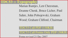
TDC53 and TDC2 2007 competitions have had their deadlines extended to Friday, January 20. The TDC homepage notes that the amended forms for submission were revised December 21, 2007. Now, I'm not in any position to be picky when it comes to silly errors, but...
Due to massive staff shortages, Monotype have been forced to appoint Doug Shaw as the CEO and president. The poor thing - if an average working week is 40 hours, he'll have to manage 80! That is how it works, right?
Yves alerted me to an interesting thread over on the Typophile forums. Seems that Letterhead Fonts has instigated an unusual copy protection system for their fonts that's causing a bit of bother. Stephen Coles puts it succinctly as ever, "It is frustrating, indeed. But I fear Letterhead will see a decrease in sales, not the number of pirated fonts. The right anti-piracy method has not yet been developed, and until then, legitimate customers will suffer. It's best to continue to create and promote great type. Most of the pirates wouldn't buy the fonts anyway." Well said!
In the last couple of days, Quark XPress has been updated to 7.1, with a number of speed and bug fixes, and the correct spelling of Ukraine. No, really...
Digit magazine in the UK has posted an interesting article on motion typography . And what would an article on motion typography be without referencing Kyle Cooper's Se7en title sequence?
Extensis' booth at Macworld will be hosting type related fun this week. Starting tomorrow, with Stephen Coles leading a discussion titled The Art of Type from 1 til 2pm. Wednesday features an expert panel (including Thomas Phinney) on Working with Type in Design Applications from 1.30pm til 2.30pm. Finally, Thursday and Friday come complete with Chank Diesel's High-Octane Type (whatever that is) from 1.30pm til 2.30pm, and Working with OpenType on Friday from 12.30pm til 1.30pm. That's if you can drag yourself away from your new iPhone, of course.
Hrant Papazian will be running a 14 week evening course on typeface design from January 19 through to April 20th, at the Art Center at Night (part of the Art Center College of Design, Pasadena). I can't find the course details on their website, so you'll have to dig it out yourself for the moment.
In memory of Elvis, Cape Arcona is giving away a copy of their previously unreleased CA Fragile (via email). But you have to be quick, the offer runs out at midnight, CET today.
Insider Software (makers of FontAgent Pro) have released Smasher 1.5, a utility to help fix common font display and output problems under Mac OS X.
Nope, not an exciting new British hardcore band. Novia and Antenna are the latest releases from The Font Bureau, designed by Cyrus Highsmith. It's 1.44am, I'm off to bed.
The dates for ATypI's merry old jaunt to Brighton have been confirmed. This year's conference will run between Wednesday, 12th September 2007 through to the Sunday. There is to be a call for papers and workshop proposals later this month.
Happy New Year! The development of the site has reached v4beta3, which went live this morning. Changes? RSS feeds are now available for both the news and Bald Condensed. If you find the column width a little too tight for longer pieces, you can now flip to full width viewing (it's the little += icon next to my or Yves' name). Body copy is now set in Georgia. Development will slow for a while now so I can get back to more regular posting.


