It is with great trepidation that I return to Bald Condensed. Apart from a final convulsion at the occasion of the last redesign of Typographer.org – argh, it is
almost a year ago – I have been conspicuously absent on the website I
owe so much to. Yet I don’t think it is just a matter of having not
enough time; it is more of a management problem. And that’s one thing I
really need to get under control.
You see, there’s people that plan to stop smoking. And then there’s people who simply, you know, stop. For far too long I belonged to the former category. Maybe it’s time to try the latter approach. I have other pressing matters to attend to as well, but don’t we all.
The Best of 2008, twice
It’s March, spring is in the air, and this means Oscars time, also in the wonderful world of type design. Blogs and websites have submerged us with Best of and Top Ten lists, but we all know we’re waiting with baited breath for Typographica’s “Our Favourite Fonts of 2008” to be published for the fifth consecutive year already. This unofficial award list has carved out a prestigious reputation in the type world. And yes, just like every year I was also able to write a short review for that one as well – I’m really digging my own grave here. Stephen just gave me the scoop – you gotta love instant messaging – there are nearly twice as many participants as in previous years. It will be launched with a Typographica redesign, which sees the website move away from a blog format and toward a gallery/showcase style site to give more focus to reviews/essays, less to news.
The “real” awards for type design are of course TDC2. Last month the Type Directors Club of New York announced the TDC55 and TDC2 winners. Whereas in the past there may have been some awarded typefaces that I didn’t really agree with, the quality of the winners the past couple of years has been consistently high. Maybe this might have something to do with the judges. Either way, this year the roster was quite impressive. The jury was chaired by Fiona Ross, lecturer at University of Reading, and Associate Designer to Tiro Typeworks. It included type design superstars Ken Barber, letterer supreme and surveyor of popular culture with House Industries; and Jonathan Hoefler of Hoefler & Frere-Jones, one of Matthew Carter’s favourite talents in the business; furthermore type designer/archaeologist/conservationist and foundry owner Richard Kegler of P22 Type Foundry; and the delightfully lyrical Gabriel Martinez Meave of Kimera Type Foundry, Mexico.
One thing I don’t like about TDC2 is that each year the winners are simply listed with a sample, but without any background information on the type design. And this is what interests me most. We can see for ourselves that indeed these are beautiful, well-crafted faces, but it is often enlightening to hear from the designers themselves what was their motivation to design them, what kind of research went into them and what they tried to achieve. This helps for a better understanding of the faces in particular, and the craft of type design in general. This is why I have contacted all the winners and compiled what they sent me into two entries on The FontFeed - TDC2 2009 | The Display Faces and TDC2 2009 | The Text Faces. I even managed to get fresh MATD Reading alumnus Mathieu Réguer to guest edit a post about Cassius, which won in the Type Systems category.
RTF Stern
There is one typeface missing in the many overviews of 2008 that still deserves to be mentioned. Jim Rimmer’s RTF Stern already popped up on Typographer.org when it appeared on the market, and it has been written about elsewhere as well. Yet as is often the case with releases that are slightly out of the ordinary – in this case the first typeface to be simultaneously released in metal and digital – little attention goes to the actual design of the typeface. This is why I decided to take a look at this (literally) singular release.


I got in contact with Jim Rimmer’s work quite early in my discovery of type, when I stumbled upon Albertan, then still published in the Lanston Type Co. collection. I was surprised to find out it wasn’t a classic design by someone like FW Goudy, but the work of a contemporary type designer. Although I was much more into “slick” type in those days, there was something in this apparently “rough” design that exerted a strange attraction on me. Heck, those were the days that I considered myself cutting-edge for trying out Monotype Grotesque and Perpetua as alternatives for Helvetica and Times respectively (I challenged myself to use typefaces I didn’t like, as a means to broaden my taste in type). Yes indeed, I’ve come a long way; you can all stop laughing now.
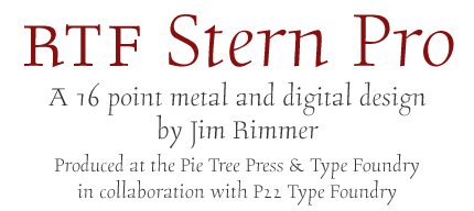
I recognise this certain ruggedness in RTF Stern as well. Although, ruggedness maybe is not the proper word for it, because personally I find its design quite refined, without being too precious. This is a bit difficult to put into words as a non-native speaker, but what I mean is that you can almost feel the design was crafted by hand, that it has been laboured over. It is in the tension in its curves, the determination in its serifs, the joy in its lithe ascenders, the resolve one senses in its character shapes. The hand-crafted feel is enhanced by the slight variations in serif structure which creates a kind of liveliness, and the apparent absence of any straight lines. The typeface looks elegant, yet feels dynamic and alive. Its design and shapes are informed by Jim Rimmer’s specific design process. From the unabridged press release:
Besides the fact that RTF Stern is the first-ever simultaneous release in metal in digital type, it is also a single style text face, taking it back to the roots of typesetting. Indeed, the concept of coordinated type families is a fairly recent phenomenon. Originally italics were designs in their own right, unrelated to Roman designs and used independently. Only by the sixteenth century did the italic assume its current role as emphasis, a variation on the Roman design. The first related bold weights for text faces are even more recent – they date from the second half of the nineteenth century. Despite its Roman capitals the asymmetrical serif structure reveals RTF Stern to be an upright italic. The subtle slant of less than 2° in the lowercase is barely noticeable.

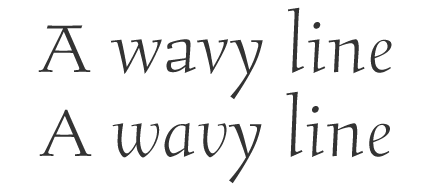

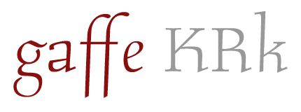
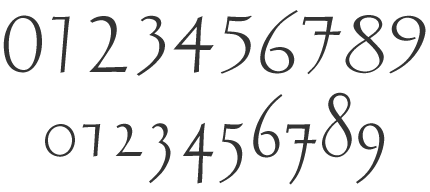
Over time I have witnessed P22 grow increasingly confident, with feature-rich multi-laguage OpenType fonts becoming more the rule rather than the exception in their releases. This applies to RTF Stern as well. It may be a single face, but it is very well equipped. Three different capital heights, alternate shapes for a number of key characters, different sets of numerals, and more ligatures than you can shake a stick at make it a very versatile design. OpenType functionality and handy stylistic sets ensure that the fonts can be tailored without effort to achieve the perfect appearance. Personally I really like the vibrant standard a, descending f, the delightful little gap in the top bowl of the g, the A with the top serif, and the (literal) knee-jerk motion in the leg of the R, K and k that I also appreciate in Stefan Hattenbach’s Luminance and Mário Feliciano’s Garda Titling II & III. I do have a minor criticism, but it really is a matter of personal taste. I am not so fond of the numerals, as they feel a little wispy to me.


If this review feels a bit short – hey, it is only one single typeface after all – you can always head over to The FontFeed for an interview with Jim Rimmer.
The making of this typeface is also being made into a documentary shot in
HD video. A trailer can be seen here.
You see, there’s people that plan to stop smoking. And then there’s people who simply, you know, stop. For far too long I belonged to the former category. Maybe it’s time to try the latter approach. I have other pressing matters to attend to as well, but don’t we all.
The Best of 2008, twice
It’s March, spring is in the air, and this means Oscars time, also in the wonderful world of type design. Blogs and websites have submerged us with Best of and Top Ten lists, but we all know we’re waiting with baited breath for Typographica’s “Our Favourite Fonts of 2008” to be published for the fifth consecutive year already. This unofficial award list has carved out a prestigious reputation in the type world. And yes, just like every year I was also able to write a short review for that one as well – I’m really digging my own grave here. Stephen just gave me the scoop – you gotta love instant messaging – there are nearly twice as many participants as in previous years. It will be launched with a Typographica redesign, which sees the website move away from a blog format and toward a gallery/showcase style site to give more focus to reviews/essays, less to news.
The “real” awards for type design are of course TDC2. Last month the Type Directors Club of New York announced the TDC55 and TDC2 winners. Whereas in the past there may have been some awarded typefaces that I didn’t really agree with, the quality of the winners the past couple of years has been consistently high. Maybe this might have something to do with the judges. Either way, this year the roster was quite impressive. The jury was chaired by Fiona Ross, lecturer at University of Reading, and Associate Designer to Tiro Typeworks. It included type design superstars Ken Barber, letterer supreme and surveyor of popular culture with House Industries; and Jonathan Hoefler of Hoefler & Frere-Jones, one of Matthew Carter’s favourite talents in the business; furthermore type designer/archaeologist/conservationist and foundry owner Richard Kegler of P22 Type Foundry; and the delightfully lyrical Gabriel Martinez Meave of Kimera Type Foundry, Mexico.
One thing I don’t like about TDC2 is that each year the winners are simply listed with a sample, but without any background information on the type design. And this is what interests me most. We can see for ourselves that indeed these are beautiful, well-crafted faces, but it is often enlightening to hear from the designers themselves what was their motivation to design them, what kind of research went into them and what they tried to achieve. This helps for a better understanding of the faces in particular, and the craft of type design in general. This is why I have contacted all the winners and compiled what they sent me into two entries on The FontFeed - TDC2 2009 | The Display Faces and TDC2 2009 | The Text Faces. I even managed to get fresh MATD Reading alumnus Mathieu Réguer to guest edit a post about Cassius, which won in the Type Systems category.
RTF Stern
There is one typeface missing in the many overviews of 2008 that still deserves to be mentioned. Jim Rimmer’s RTF Stern already popped up on Typographer.org when it appeared on the market, and it has been written about elsewhere as well. Yet as is often the case with releases that are slightly out of the ordinary – in this case the first typeface to be simultaneously released in metal and digital – little attention goes to the actual design of the typeface. This is why I decided to take a look at this (literally) singular release.


I got in contact with Jim Rimmer’s work quite early in my discovery of type, when I stumbled upon Albertan, then still published in the Lanston Type Co. collection. I was surprised to find out it wasn’t a classic design by someone like FW Goudy, but the work of a contemporary type designer. Although I was much more into “slick” type in those days, there was something in this apparently “rough” design that exerted a strange attraction on me. Heck, those were the days that I considered myself cutting-edge for trying out Monotype Grotesque and Perpetua as alternatives for Helvetica and Times respectively (I challenged myself to use typefaces I didn’t like, as a means to broaden my taste in type). Yes indeed, I’ve come a long way; you can all stop laughing now.
I recognise this certain ruggedness in RTF Stern as well. Although, ruggedness maybe is not the proper word for it, because personally I find its design quite refined, without being too precious. This is a bit difficult to put into words as a non-native speaker, but what I mean is that you can almost feel the design was crafted by hand, that it has been laboured over. It is in the tension in its curves, the determination in its serifs, the joy in its lithe ascenders, the resolve one senses in its character shapes. The hand-crafted feel is enhanced by the slight variations in serif structure which creates a kind of liveliness, and the apparent absence of any straight lines. The typeface looks elegant, yet feels dynamic and alive. Its design and shapes are informed by Jim Rimmer’s specific design process. From the unabridged press release:
The process Jim used to create Stern illustrates his remarkable approach to type design – using the same process for decades, all of his rough work is done by hand before being translated into digital forms using the program Ikarus. After the characters are designed in Ikarus using a plotting pen, they are output to a laser printer. Although there is nothing new about this part of the process, Jim’s application takes it a step further by using it as the basis for his metal type design and casting. From this point, a paper master pattern, then a lead working pattern are created and scaled to a brass matrix (16 point, in the case of Stern). The matrix or mould casts one individual letter, one piece of type at a time. Noted typographer Frederic Goudy used a similar engraver to the same effect in creating typefaces for his own Village Type Foundery.
Besides the fact that RTF Stern is the first-ever simultaneous release in metal in digital type, it is also a single style text face, taking it back to the roots of typesetting. Indeed, the concept of coordinated type families is a fairly recent phenomenon. Originally italics were designs in their own right, unrelated to Roman designs and used independently. Only by the sixteenth century did the italic assume its current role as emphasis, a variation on the Roman design. The first related bold weights for text faces are even more recent – they date from the second half of the nineteenth century. Despite its Roman capitals the asymmetrical serif structure reveals RTF Stern to be an upright italic. The subtle slant of less than 2° in the lowercase is barely noticeable.


Over time I have witnessed P22 grow increasingly confident, with feature-rich multi-laguage OpenType fonts becoming more the rule rather than the exception in their releases. This applies to RTF Stern as well. It may be a single face, but it is very well equipped. Three different capital heights, alternate shapes for a number of key characters, different sets of numerals, and more ligatures than you can shake a stick at make it a very versatile design. OpenType functionality and handy stylistic sets ensure that the fonts can be tailored without effort to achieve the perfect appearance. Personally I really like the vibrant standard a, descending f, the delightful little gap in the top bowl of the g, the A with the top serif, and the (literal) knee-jerk motion in the leg of the R, K and k that I also appreciate in Stefan Hattenbach’s Luminance and Mário Feliciano’s Garda Titling II & III. I do have a minor criticism, but it really is a matter of personal taste. I am not so fond of the numerals, as they feel a little wispy to me.


If this review feels a bit short – hey, it is only one single typeface after all – you can always head over to The FontFeed for an interview with Jim Rimmer.
The making of this typeface is also being made into a documentary shot in
HD video. A trailer can be seen here.
