Today saw the launch of a new design for one of the most popular websites on the planet, BBC News. Does anyone else think that the BBC have been a tad ham-fisted with their new web branding? I hope I'm not alone in finding it a little blunt.
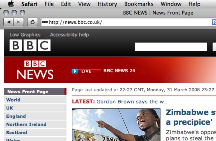
Two BBC logos? That appear to be slapped on with no thought for each other? The overall grid seems a tad amateurish compared to what went before, and the right hand bar of links is oddly arranged. Worse, on an iPhone / iPod touch the design falls down, when it was once perfect - they've not even set the viewport correctly. I'm hoping it is just teething troubles.
Two BBC logos? That appear to be slapped on with no thought for each other? The overall grid seems a tad amateurish compared to what went before, and the right hand bar of links is oddly arranged. Worse, on an iPhone / iPod touch the design falls down, when it was once perfect - they've not even set the viewport correctly. I'm hoping it is just teething troubles.