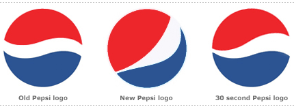
Armin over at Brand New has interesting news on a redesign of the Pepsi logo. There are going to be three of them, for Pepsi, Diet Pepsi and Pepsi Max (a smile, a grin, and a laugh respectively).
What a crock of shit. They’ve failed to identify what it is about the Pepsi logo that people recognise. Its the wiggle, the circle and the colours in combination, not just the circle and the colours, dummies. The new logo looks like a logo for a toy company, or possibly even a paintballing centre, but its certainly lost what it means to be recognisable as Pepsi.
So, in the true spirit of this site, I decided that I could do better. In 30 seconds. See above, and below for the speech to the board of directors.
Dear assembled, thank you all for inviting me here today to introduce DaveCorp’s work on the reinvigorated Pepsi brand. The key message we wanted to give was that of abundance, of more, combined with our other message-givers of accessibility, recognisability, shelflifeability and modernity. The new design had to by dynamic and fluid, to, if you like, represent the dynamic thirst-quenching ability of our fluid product.
Token lady and gentlemen, I present to you a new interpretation on the Pepsi marque that will take Pepsi into the 21st Century. Starting with a trickle from a soda fountain, meandering into a mighty river of carbonated beverage, widening into to an estuary of taste before emptying into an ocean of refreshment. I give you the Pepsi World River. Always more.
Now, where’s the coke… er, I mean the cocaine. [laughs all round]