Just a quickie before I head to bed: P22 today released an expanded Sniplash family, for that 60s vibe. Ohh and look, it's on sale too.
Today saw the launch of a new design for one of the most popular websites on the planet, BBC News. Does anyone else think that the BBC have been a tad ham-fisted with their new web branding? I hope I'm not alone in finding it a little blunt.
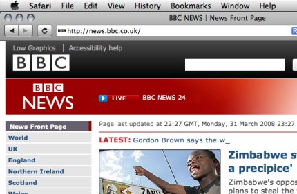
Two BBC logos? That appear to be slapped on with no thought for each other? The overall grid seems a tad amateurish compared to what went before, and the right hand bar of links is oddly arranged. Worse, on an iPhone / iPod touch the design falls down, when it was once perfect - they've not even set the viewport correctly. I'm hoping it is just teething troubles.
Two BBC logos? That appear to be slapped on with no thought for each other? The overall grid seems a tad amateurish compared to what went before, and the right hand bar of links is oddly arranged. Worse, on an iPhone / iPod touch the design falls down, when it was once perfect - they've not even set the viewport correctly. I'm hoping it is just teething troubles.
I've got 24 minutes while this 137 megabyte screensaver downloads but something tells me I'm going to wet myself when it is installed and running. At least, if the preview video is anything to go by.
Well, we promised the site would be back properly for early April, and it soft launched a few days ago. Seems like people picked up on it and started linking (thank you!) so the process has been speeded up a little. News archives are up, Bald Condensed is in place (and due for an update in just a few short days) and the news RSS feed is fixed (if you've seen any odd entries, now you know why). Let us know what you think.
Another day, another online micro distillation of The Elements of Typographic Style on how to typeset. Another chance to remember that we're all just wrong. Stop being wrong, OK? OK? Just stop. Maybe I'm being mean, maybe I'm being defensive cos I'm lazy when it comes to online settings (RSS, I hate you). But really, the bit about using the correct interpunct in prices?
Open source font editor FontForge got an update a week or two ago. Actually, it gets an update about once a month, but I thought it useful to remind people that there are alternatives to the excellent (but expensive) FontLab products.
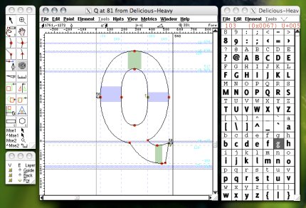
FontLab is worth the money, make no mistake, but there are plenty of people out there (especially in poorer nations) that could get a full computer and all the software they need to do typeface development for less than $300, rather than what many do, sat at $3000 hardware and software setups. Available for Mac (under X11, native on PPC and Intel), Windows and Linux.
Update: Actually it got another update yesterday, but the binaries aren't ready to download yet. If you are that bleeding edge, you could always wait a few days.
Prime, straight, neutral, curly, smart, typographer, whatever. First, Ministry of Type and now Design Observer. Leaving aside the similarities between the articles for a moment (I'm not opening that can of angry hornets), I'll just say this: language evolves, its purpose is to communicate ideas between people - that transaction may not involve you, so please do not expect that transaction to follow your rules.
iLT has a fun piece on the nomenclature and etymology of type and type anatomy. End your week working for the man (or indeed, the woman) with a little reading, why not?
Safari 3.1, which has been floating about now for a week or so for Windows and Mac, has support for CSS3 web fonts (using OTF), and SVG advanced type. I haven't a clue what the latter is, but the former is pretty nifty. Broken Links even shows you how.
If you have been umming and ahhing about travelling to St Petersburg to present at ATypI 08, you're in luck - the deadline for submissions has been extended to the 14th April 2008.
Now, if I read the headline of Open Source dangers, followed by Article highlights danger of unpatched Freetype implementations, I think I would get the idea that the article in question was about Freetype. Or even, it was a general article that had specific examples of dangers in Freetype implementations. Or, at a real push, I'd expect to see something that discussed a specifically open source issue.
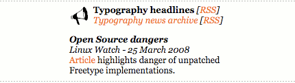
What I wouldn't expect is a general article reminding people that they should probably make sure they update their system regularly, and that applications that use system or other resources are reliant on those other software developers for some of their updates. I don't think I'd expect the article to only fleetingly mention Freetype in the same way as an article about fruit going off may mention grapefruits, bananas and peaches, in passing, as examples of fruit.
And I really really wouldn't expect such a transparently cynical dig at open source software to be the top story on MS Typo News. By the way, how is proprietary software safer, when you can't see the source and you can't fix a problem?
What's long, brown and lands in your box once a month? Yes, the March edition of MyFont's In Your Face newsletter is now available. Why, what did you think I meant?
Never mind the over-saturated hell of CSI, with its gaudy coloured gels shoved over seemingly every single light source their crazed DOP can find, how about forensic typography? It is all in the full stops, period.
Brand New have an interesting piece (including a good set of examples) showing the Massachusetts College of Art & Design, a branding exercise that is a few months into rollout. I'm all for well-executed typographic solutions rather than resorting to banal tricksy graphic devices, and this one is definitely the former. Jolly good!
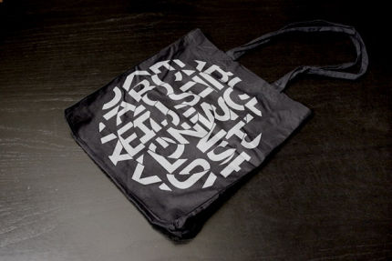
Now the format wars are over and we can all settle on Blu-ray, I'm sure you'll all be rushing out to buy the high definition version of Helvetica. Naturally, being aimed at design-types, there is a special edition available for only $125, comes with a cheap nasty looking tote bag that probably cost $3 to make, and is signed by Gary Hustwit.
So let's call that a $90 premium over the standard edition, be generous and call it $85 extra profit per disk, times the "limited edition" of 1,500, that is a healthy $135,000 bonus for someone. Now, how much do you really want the limited edition one again?
So let's call that a $90 premium over the standard edition, be generous and call it $85 extra profit per disk, times the "limited edition" of 1,500, that is a healthy $135,000 bonus for someone. Now, how much do you really want the limited edition one again?
Fancy wiping out a significant proportion of the professional type community with one well-placed plate of poisoned toasted ciabatta sarnies? Matthew Carter, John Downer, Akira Kobayashi and Erik Spiekermann are all going to be at SOTA's TypeCon2008, being held between the 10th and 15th of July in Buffalo, New York. The title? Punkt. Punkt?
Noticed there haven't been many updates? That'll continue. The site is effectively down for a few weeks while I set up a new physical workspace and edit the site's templates to reflect the changes in content that are on their way. Running a website perched on the edge of a bed with a partially broken laptop hasn't helped the last few months, but that's about to change. Come back in very early April, and I'll try and get an announcement on some of the other type sites when the site is back properly.